Project Overview
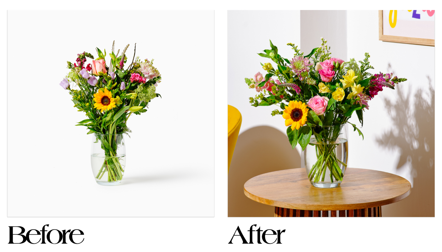
I was tasked with enhancing the appeal of flowers and plants on the website while staying true to thortful’s brand identity. Through research and analysis, the focus was on four key aspects: improving overall appearance, conveying a sense of scale, distinguishing between standard and occasion-specific products, and refining product descriptions.
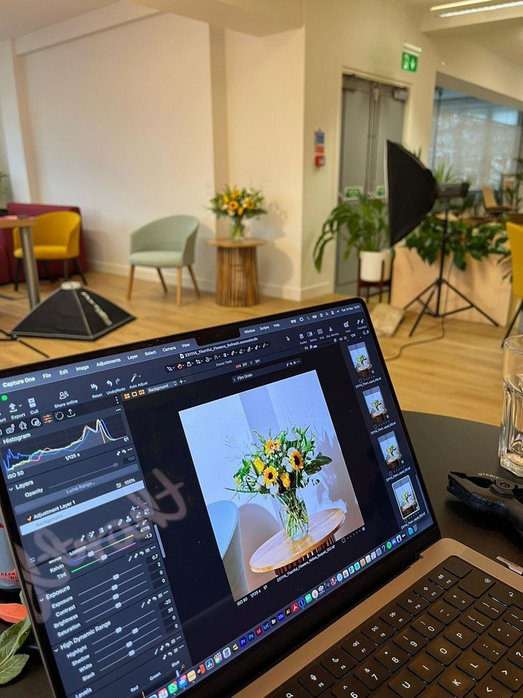
You can explore the full process and style guide by viewing the PDF here.
The Challenge
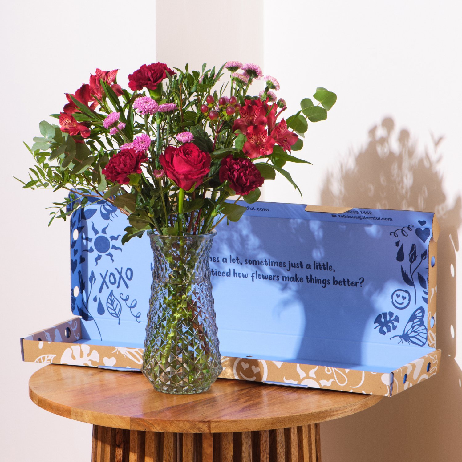
The goal was to develop a versatile image style that worked seamlessly across different product types—flowers, plants, letterbox flowers, bundles, and occasion-specific arrangements—while remaining distinctly recognisable as part of thortful’s brand.
The Results
The new imagery had an immediate impact:
• +20 percentage points in checkouts via carousel images in the first month.
• +3.4 percentage points in click-through rates from gift-focused pages.
• For the first time, all Valentine’s Day and Mother’s Day occasion flowers sold out at full price, eliminating the need for last-minute discounts.


“This multifaceted nominee could have taken home a number of awards, best original sound track, best costume, best visual effects. Their passion for thortful shows in their pride for their work. So for their work on ‘Flowers: The Rebrand’ the award for best picture goes to Tasha of the Design Team!”